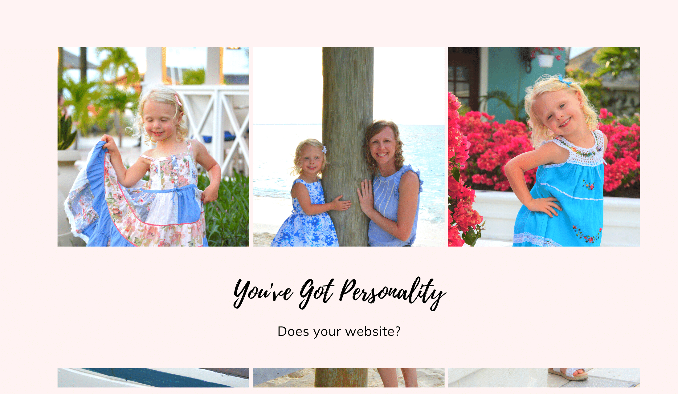
She’s full of personality. That’s what some say about my sassy, four-year-old as she flips her hair at the dinner table, smears her spaghetti sauce on the placemat, and pushes her milk aside in protest. I, on the other hand, with fumes coming out of the top of my head, call that attitude.
Either way, it’s easy to imagine what someone is like with a big personality. Naturally drawn to them, others flock to people like this. I know because that same toddler has a more active social calendar than our entire family.
Now, try that phrase out on a website – your website is full of personality. It’s hard to picture what that means digitally, but it might sound like something your website needs. It’s okay if you’re unsure what that looks like because you’re about to learn how to create a website brand and personality that attracts more visitors.
Tone of Voice
The tone of voice is how you sound to others. Just this morning, I gave Miss Sassy Pants an overview of the topic after using her not-so-nice tone of voice to give me directions. Or as I like to say – tell me what to do.
I asked her, when mommy yells, “ADDISON GREEN,” what does that mean?
Her response was, “something bad.”
I said, “correct.”
Then, I asked her, when mommy calls you in a cheerful voice, “Addison,” what does that mean?
Her response was, “something good.”
I told her, “correct, again, now you know how what tone of voice is.”
Like when we were kids, we easily pick up on the tone of voice and emotion written on paper, used on a website page, typed in an e-mail, or spoken in person through the inflection of the words, punctuation, and language used. Is the author happy, sad, full of joy, hopeful, mad, cold, harsh, professional, and many more you could use here?
If you’re using slang and more casual, conversational words and phrases, your audience will find you more approachable. However, gone too far, and if it’s not in the right setting or doesn’t fit the product or brand, it could come off as unprofessional. On the contrary, if you’re more formal, professional, and use words that require a dictionary to translate, the audience could find the content boring or hard to read, especially if they’re Googling every other word.
So, how do you find the right tone of voice for your site? While it’s a part of curating your overall brand, your website is only one area, but an essential one, where your brand comes to life. If you haven’t developed a tone of voice, start by answering the next series of questions for your website.
- How do you want visitors to feel after visiting your website?
- If your website were a person, how would it sound?
- When visitors leave your website, how do you want them to perceive you?
Answers for Sprout Marketing include:
- Welcomed, informative, and hopeful
- Friendly and warm like talking to an old friend you haven’t seen in years
- I’m professional, experienced, but approachable and easy to talk to
Now, if this is the first page you’ve read, you may need to look back at a few other pages to hear what I’m talking about – literally. And, if this isn’t the first thing you’ve read on my site, does this sound accurate? If not, then I have a lot of work to do in my writing.
Once you identify the tone of voice, the hard part is achieving that goal through your writing. Using the same author, giving clear direction and examples to any new writers, and creating a brand style guide that defines your tone of voice helps it consistently hit the mark.
Point of View
Followed by the tone of voice is establishing a point of view for your website brand.
Here’s a quick overview for those of us who need a refresh on the point of view:
- First-person point of view – The use of I, me, my, we, our, or us as pronouns
- Second-person point of view – The use of you, your, or yourself as pronouns
- Third-person point of view – The use of he, him, she, her, it, its, they, them, their, theirs, or themselves as pronouns
Sometimes, corporations will use their name repeatedly in website copy along with pronouns like they, their, or its to talk about themselves, their services, and products. This third-person point of view writing sounds more corporate and formal to readers. It may be perfect if you’re the IRS, but not so great if you want to be relatable and approachable to website visitors and encourage them to fill out a form interested in your business. When the internet was new, many first-version websites sounded this way. Unfortunately, some still haven’t gotten the much-needed love they need and deserve to evolve.
It’s common to use a combination of the first-person and second-person point of view in website copy. This shows your audience that you understand their perspective, that you’ve been there before, and know how they feel. I use this approach in my writing.
Be sure to pick the point of view that helps achieve your tone of voice goals.
Website Brand Personality

If your website were a walking talking human being, how would you describe it? Are you drawing a blank? Don’t worry; I’ve got your back. Here’s a handy list with some human personality traits. I challenge you to pick five from the list. And it’s only to jump-start your ideas; you may think of many more, not on this table.
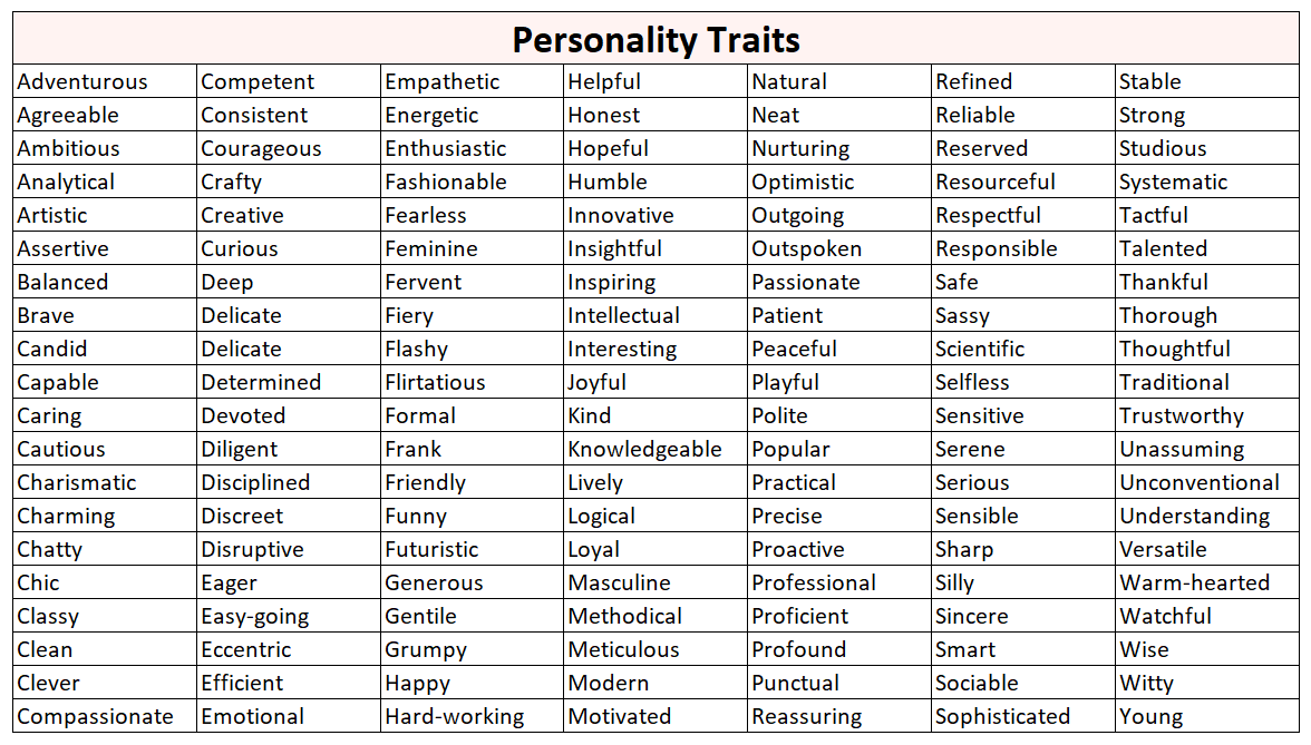
Are you still stuck? Okay, I’ll go first. For Sprout Marketing, personality traits to describe my brand include caring, feminine, helpful, knowledgeable, trustworthy, and warm-hearted. Of course, you may need to check out more than this blog post to see all of those traits, so I encourage you to surf around a bit if you disagree.
When I teach web development to my college class, this is the hardest concept. It’s easy to describe what you see and hear. It’s harder to define what’s missing or an evolution of a brand. Unfortunately, this exercise is asking you to do just that.
Maybe your current website is outdated but informative, serious, precise, and reliable. If you’re refreshing your brand or doing a website makeover, then you need to evaluate if this personality still fits. If it doesn’t, then determine what human traits the new version needs.
Online, we’re just real people doing business with real people behind the screen. Even if the brand represents many people, they’re still people doing business with other people. What personality traits do those people have collectively? That’s what should come to life for your brand.
Aesthetics
Aesthetics is the use of graphics and other media such as video, color, and typography on your website. Let me break these down individually.
Color
Color represents an emotion or builds a perception of your brand. Marketers have studied the psychology behind color for years, and many corporations have built successful brands based on this data.
Use color to develop the brand personality you want to portray. For example, pink represents my traits of feminine and caring, while black wouldn’t as well. On the other hand, if I were going for powerful and strong, black or red would be excellent. Could you imagine the Harley Davidson brand in pink? It wouldn’t be the same.
Green represents the growth I give clients in their business. When you shop the produce aisle at the grocery store, what color do you see? Yep, green! In addition to growth, freshness, wellness, and healthy are also associated with green.
When you select a color palette, be intentional about the meaning behind the colors for your audience. People get passionate about brands they form an emotion with, and passion leads to loyalty. Color plays a role in this process.
Graphics and Media
Graphics and media refer to any photos, videos, illustrations, infographics, sound, and other similar types of media used on your website. In addition to color, any media used must reflect the personality you’re creating.
If you look back at the main pages of my website, you’ll see a lot of greenery in addition to the pink accents. The greenery helps build on the growth aspect and wouldn’t resonate if I used pictures of desk set-ups or office spaces. Also, you might think I was selling office furniture or equipment instead.
Finally, keep everything consistent. All media should look and sound like it belongs together. Let’s use an example for this exercise. Do the two photos below look like they belong on the same website?
Guessed, yes? You’ve got it. Often, a simple edit or not editing a photo can make a difference. Using the same filter or editing process can also help with consistency.
These two photos use the same color tone and probably remind you of summer. They were both taken during the summer near the beach.
Now, do these two photos look like they belong on the same website?
If you guessed no, then you’re correct. The filter used on the baby photo is much whiter and lighter. It reminds you of comfort, peacefulness, and newness. Red and orange tones would pair well with the fall photo, and you think of cooler days and changing seasons.
Now you may be asking, do you use your photography (which probably means taking photos) or use stock photography. There’s no right or wrong answer to the question, it’s what’s suitable for your brand, and it could be both. Many highly successful brands use a combination of both. It can be impossible to take all of your photos, and using stock can add that little extra splash that you need.
Typography
Now, carefully select typography (also known as fonts) for your website based on the overall brand and personality you’re creating. As a best practice for text used in the body of the page, use a Sans-Serif font because it’s easier to read. You’ll be writing more extensive text areas, so it needs to be as easy to read as possible.
The below illustrates the difference between the two fonts visually.

Once you pick your main paragraph font, choose another one to accent your website. Often used in headlines, calls to action like in buttons, quotes, sub-headlines, and other areas you want to create a visual break in the page. You might go with a script or cursive for something more warm, feminine, or classy feel. And, for a more masculine, strong, bold look, you might want something in all caps, in bold, or a thick, heavy-weight style.
Try several different fonts. You’ll see as you switch them out, the personality of the page will change. Don’t settle until you find just the right fit.
Create a Mood Board
A mood board is a collection of images, text, samples, and other objects that should represent the vision of the brand you’re creating. It’s a way to pull together ideas and a general feeling about the brand. Create a mood board in either physical or digital form.
Find inspirational items for the tone of voice, point of view, personality, color, photography, typography, and more. They should all be a part of your mood board. Don’t leave out anything.
I created my first mood board in a PowerPoint deck not long after I developed my logo. I needed a way to pull together a few ideas I had.
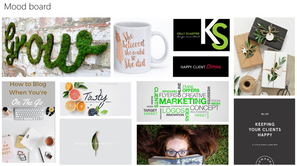
Then, when I worked with the freelancer that developed my website, she created a shared, private board in Pinterest that we both pinned ideas to. I LOVED it! Already addicted to Pinterest with more recipes pinned than I’ll ever cook, it was fun to do, and it helped curate what would become Sprout Marketing.
We later talked about why I liked specific PINS and what I liked about them. For example, the PIN on the first row on the far right, I liked the balance of white space and clean, sophisticated design. Someone else might say they like the use of close-up photos. Everyone sees things differently, so that conversation was critical to building my website brand and personality.
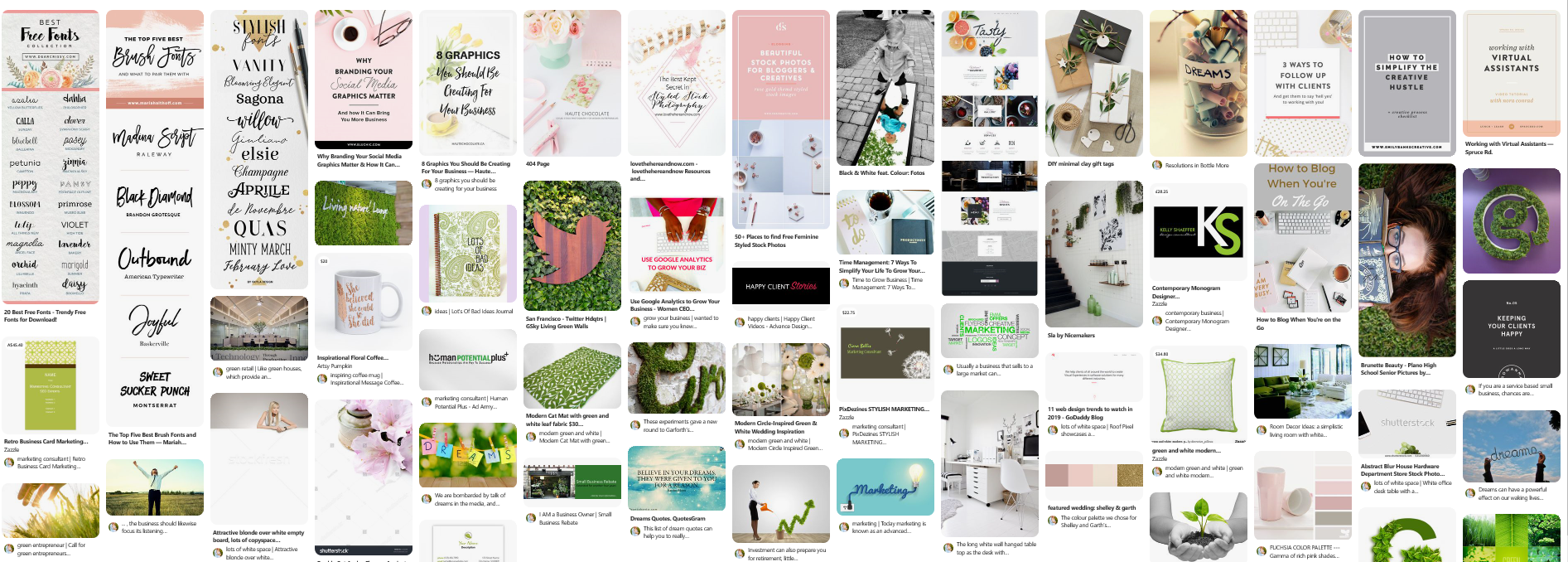
I still have this board and look back at it when I’m adding something new to the portfolio. Like a lighthouse guiding a ship at night, it gives me the direction I need to determine if something is on or off-brand.
Find your tone of voice and point of view, develop a personality by choosing human-like traits, and carefully select colors, fonts, and photos that turn your dream into a reality. Now, you might be asking how in the world do you get it all done? Rarely done alone, phenomenal branding takes skill and usually more than one person.
I want to say that I did it all myself, but that’s not true. As you can see from my mood boards, I had a vision for Sprout. Vision is my skill, but I needed an extraordinary designer to mix my vision with a bit of magic and bring it to life.
I’ll never forget the first time I saw a draft of my homepage; tears welled in my eyes. And that’s when I knew; I’d nailed it.
As you venture down this path, ask for help when you need it. Developing a website brand and personality that you and your customers love is too important not to get right the first time. And, if you need some help, I’ll be here.
Ready, set, grow!
All my best,


Leave a Reply