You receive some inquiries from your website. But could you get more? A website’s homepage should attract as many potential customers as possible (also called leads), meaning you can help more people and invest in your dream.
A homepage that converts requires a combination of art and science. In art, you craft simple, easy-to-understand words and phrases that leave people wanting more from your brand and use images that resonate. With science, you follow a proven framework and best practices that work.
I’ll touch on using art but mostly focus on the science of making a website homepage that turns as many visitors as possible into customers.
The Hero Block
Separate blocks on your website break up copy and images as you scroll down the page. For example, the hero block appears as the first section you land on when you type in a URL (website address). This block takes the most time and energy to craft because it serves as the first impression website visitors have of your company.
Many websites sound cute or clever or make a profound statement before clearly saying what they offer or do. People unfamiliar with your business that find the image vague will quickly move on to another website. Sound like your website? Then, it’s time to rewrite your hero block copy.
Why? Website visitors don’t have time to figure out what you do or how you can help them. So, in five seconds, you need to share what you offer, how you make their life better, and how they can buy what you offer.
Should you use a carousel with changing images and copy? Very few people will sit long enough to read and watch the pictures and words change. And often, you can’t read everything before it changes, only frustrating potential customers.
Make the copy easy to read. Use as few words as possible. And use simple words. That’s all you need in the copy for the first block.
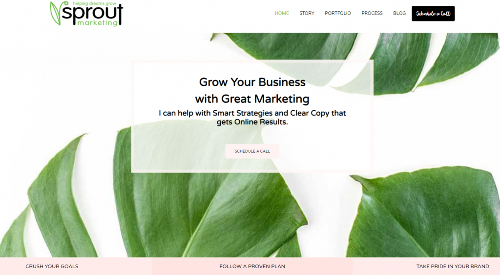
Let’s look at my hero block as an example. While I offer many marketing services, writing copy and developing a marketing plan through strategy drives results. “Grow your business with great marketing” states the result a client can expect when they partner with me. The following line explains how your business will grow with “Smart Strategies” and “Clear Copy.”

For the image, if possible, show your potential prospect engaging with your product or service. You can also show the look of success or transition that happens when using your product or service.
For example, an HVAC company restores heating and air in a home, making it comfortable inside again. Instead of showing a picture of the HVAC unit outside the house, show a family inside their home, having fun together comfortably.
Write a Strong Call to Action
What’s a strong call to action (CTA)? It’s a short phrase that encourages people to take action and that next step to do business with you. A strong call to action is written in an active voice and removes any vagueness or questions.
Some examples of a strong call to action include buy now, get a free consult, make an appointment, call now, book now, download my e-book, sign-up now, donate today, register now, join today, etc.
Many websites that don’t convert well lead with a passive call to action. While a passive call to action may begin with a verb, the phrase lacks clarity for the website visitor.
They’re left wondering what’s the next step to engage with your product or services. Or, worse, you don’t show enough confidence to ask for the business. No one wants to sound salesman-like, but confidence attracts just like a lack of it repels.
Examples of passive calls to action include: learn more, start now, find out more, contact us, etc. They require research, and the website visitor may or may not have time. Even if they take the time, then what’s next? Don’t send browsers on a wild goose hunt. They’ll leave.
Notice in my hero block, I use “Schedule a Call.” A call helps me and the potential client determine if we’re a good match to continue doing business together.
Once you have a leading strong call to action, where does it go? First, on the hero block, place it in the top right-hand spot on the menu header and with the hero block copy.
Why both spots? Your eye scans this block in a “Z” pattern stopping in the top right and middle area. So both places increase your chances of conversion. Also, make your menu header a sticky menu header.
A sticky menu header remains on the page as you scroll down. That way, browsers can easily find the main menu items, including the strong call to action, anywhere further down on the page.
Then, for consistency, include the same leading strong call to action in every block on the homepage. One exception allowed comes if you have a products or services block that links to internal pages.
Here, a passive call to action like “learn more” seems appropriate because you want to give more information to people who need it. Thus, this block should provide brief details for those who don’t have time or want to do more research.
Introduce the Problem
After the hero block, introduce the problem you’re solving for. What?! Talk about a problem on my website? Everyone has problems, and many use the internet to help fix them.
Identify your buyer persona’s problem and show how you help solve it. That way, they have no question whether you can help them or not.
But, be careful about how you introduce the problem. For example, present the issue in a series of questions, or open a story loop. Stories resonate, and people find them memorable.
Share the negative side of the problem, such as what happens if they don’t do business with you. But making things seem hopeless or devastating could push people too far and give them the wrong impression. So walk this fine line and proceed with caution in your copy.
Offer Value
I often combine the problem and value block all in one block. It depends on how much copy I have for each and if it makes sense to combine paragraphs. Together, they tell a powerful story; however, sometimes, it may visually look better to separate them.
What value do you provide your buyer persona? Share the good stuff by showcasing your competitive advantage, the benefits you offer, or the results you deliver.
Write the copy in a way that helps or impacts your buyer persona. Examples could include save time, save money, or live longer. Groups of three work well. However, if you offer more, share them all.
Provide Authority
At this point, browsers will wonder… are you legit? Answer this question in this critical section through customer reviews or testimonials. Or, include a list of clients or customers you serve or certifications, awards, or accolades.
Numbers speak volumes in the form of showing scale. The number of happy customers served, years in business, years of experience of your team, successful projects implemented, and more shows you’re an expert at what you do, and you’ve done it before.
Finally, and most important in this section, show you care. When you show empathy, it positions your brand as relatable and human. If the audience thinks you’re only out to make a profit, you’ll lose people.
Show Your Stuff
Refrain from selling your products or services until you get to the fifth block, and it’s optional. Because if your copy in the first four blocks resonates with the buyer persona, they’re ready for the next steps to do business with you.
Many people don’t like to read a lot of copy—however, some people like more information or research. So, I like for this block to serve as a teaser to those interior pages. It should have very little copy that highlights the top benefits or features of your offerings.
Give Them a Plan
Finally, give people a plan to work with you. Without a plan, that call to action only leaves further questions for your prospects.
Have you ever submitted a form and never heard back from the organization? It’s happened to me more times than I can count. As a result, I feel like I’ve wasted my time and energy engaging with that business. Plus, I’m left searching for someone to help solve my problem.
I’m baffled why a business would spend time creating a website. But then fail to follow up with prospects. But, that’s a topic for another day.
Don’t leave your prospects wondering what happens next when they submit an inquiry or form. Everyone fears the black abyss of the internet. Let them know upfront.
Write a three-step plan. Too many steps overwhelm people. Too few steps fail to present a solid plan. The magic lies in the power of three.
For example, on my website, the three-step plan I present looks like this:
- Schedule a call
- Get a customized plan
- Watch your business grow
It’s that easy! A plan sets the expectation of what happens next before engaging with me.
Curate a Story
The final block is to put everything together in story form. This brings every block together and paints a picture with words for prospects. If they aren’t convinced for any reason this far, this block dispels any illusions.
Writing this section can sound redundant, and it should. You’re not introducing any new ideas. People don’t read, and this section reinforces the high points of the page in one block if they missed something the first time.
That’s a wrap on the six main blocks for a high-converting homepage! Most importantly, each section must serve your audience, not the organization. Or the audience will bounce. It’s about them, not about you. Out of everything I see on underperforming websites, they miss this crucial element. Instead, the site gives a salesy impression and focuses on its products or services from the start. No one likes to be sold to. Do you?
Using the tips and tricks above, now work some magic on your website. I’d love to hear what changes you made. Share in the comments below, or drop me a line. Here’s to improving your homepage website to increase conversions, one visitor at a time!
Ready, set, grow!
All my best,


Leave a Reply